Best Cool Violet
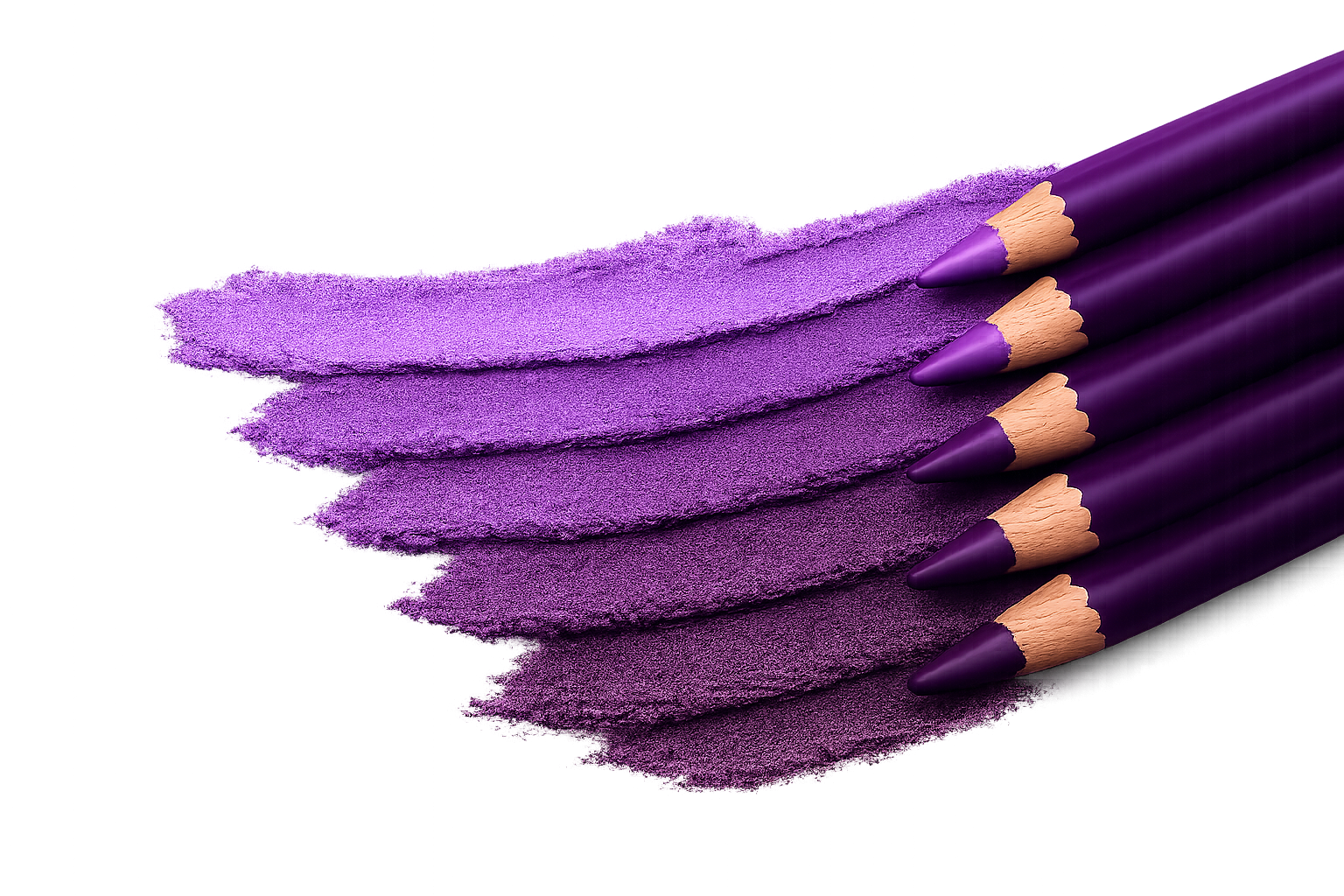
NYX Subversive SocialiteA deeper violet reference point at the cooler end of the purple spectrum.
Purple lip liners span cool violet, muted mauve, pink-purple, plum, wine, and brown-shifted directions. What looks purple in the pencil can read differently on the lips depending on its balance of blue, red, pink, and brown.
This guide separates color category from depth, then uses examples from the Niori shade library to make those distinctions practical.
At a glance
A deeper violet reference point at the cooler end of the purple spectrum.
A deep, cool berry-plum when you want definition without a true-violet effect.
A softer, muted direction when deeper purples feel too strong.
A medium-deep muted plum that sits between soft mauve and the deepest purple liners.
An accessible wine-plum option with more red influence than a classic violet.
Purple liner categories
Purple is a spectrum rather than one undertone. These categories describe hue direction, while light, medium, dark, and deep describe a separate depth axis. A liner can belong to more than one useful group.
Blue-leaning shades that read as classic purple and tend to look bolder and more saturated.
Amethyst and Subversive Socialite sit at the cooler, deeper end of the current library.
Redder purples that can feel richer or more grounded than true violet and may overlap with wine or deep red.
Plumberry, Prune, Plum and Get It, and That Merlot Tho vary in depth and in how muted or wine-leaning they appear.
Muted, often pink-influenced purples that create a softer effect than deep violet or wine shades.
Mauve Aside is the clearest current library example of this blended direction.
The boundary where muted plum or mauve picks up visible brown structure; some shades read purple first, while others look more like berry-browns.
This is an overlap rather than a rigid bucket. Compare the rosy, berry, and muted groups in the Brown Lip Liners guide.
Reduced-saturation purples that can read smoky, dusty, or taupe-adjacent rather than bright.
Greying is an effect, not a depth: a muted purple can still be light, medium, or deep.
Purple-adjacent shades that sit closer to pink and behave differently from cool violet on the lips.
Aria is the current example: warmer, pinker, and lighter-looking than the deeper purple group.
Purple liner basics
Purple sits between red and blue, but small shifts in that balance create very different results. Some shades lean strongly blue and read violet; others lean red or pink and move toward plum or mauve.
On the lips, purple liners can:
Because of this, purple is less about a single undertone and more about where a shade sits along a spectrum.
Most purple liners in the current library fall into the medium-to-deep range, but depth is a separate decision from hue. A light purple can be violet or mauve; a dark purple can be plum, wine, violet, or purple-brown.
Lighter purples often appear as soft mauve or pink-purple rather than pale saturated violet. Aria sits toward the lighter, pinker side of the current examples, while Mauve Aside offers a softer muted direction.
Medium shades can show a recognizable purple direction without the weight of a very deep outline. At this depth, mauve versus red-plum versus violet often matters more than the shared value.
Amethyst and Subversive Socialite occupy the cooler, deeper end, while Prune is a deep cool berry-plum. Similar depth does not make those hue directions interchangeable.
Describing both axes gives a more useful result: “deep plum” says more than either “deep” or “purple” by itself.
The current Niori purple library focuses primarily on drugstore and accessible mid-range options. Purple names are less standardized than brown or red names, so compare the recorded color and nearby shades rather than relying on the pencil name alone.
Because purple overlaps with several color families, comparing more than one type often gives a clearer sense of whether you want violet, plum, mauve, pink-purple, or a more grounded brown-shifted direction.
If you’re unsure where to start, a few general guidelines can help:
The same liner can look different depending on natural lip tone, which is why visual comparison is more useful than shade names alone.
With purple lipstick, begin by matching direction as well as depth. Violet reinforces a cool purple; mauve or plum makes the edge softer or redder; and a deeper liner adds contrast without requiring an exact shade match.
With pink lipstick, mauve-purple or pink-purple can cool the combination, while deep violet creates a more deliberate contrast. With red lipstick, plum and wine-purple are the closest bridge because they contain more red than true violet. The useful combination is the one that creates the shift you intend—not necessarily the pair with the closest names.
Purple lip liner has appeared in both bold editorial looks and softer everyday makeup, depending on the tone. The range extends from dramatic violet to subtle mauve and grounded plum.
Treating purple as a spectrum rather than a single category makes it easier to find and compare shades that create the effect you want.